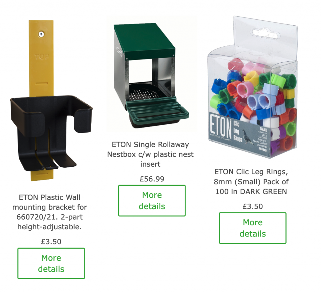
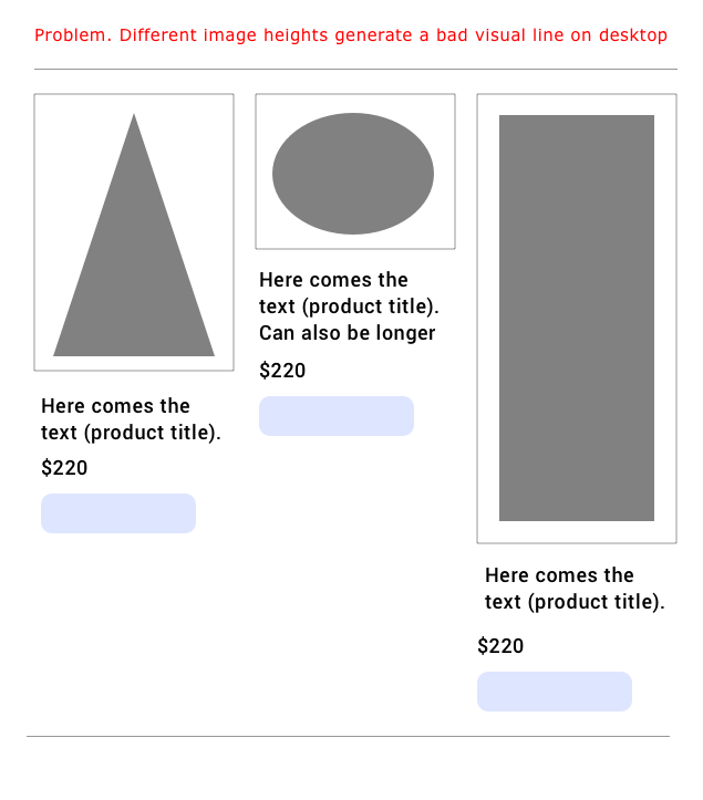
Sometimes different heights for product images generate a bad visual inside desktop email clients. On top of the images, sometimes there are different length in product titles, which can lead to the same problem.
Real email example:

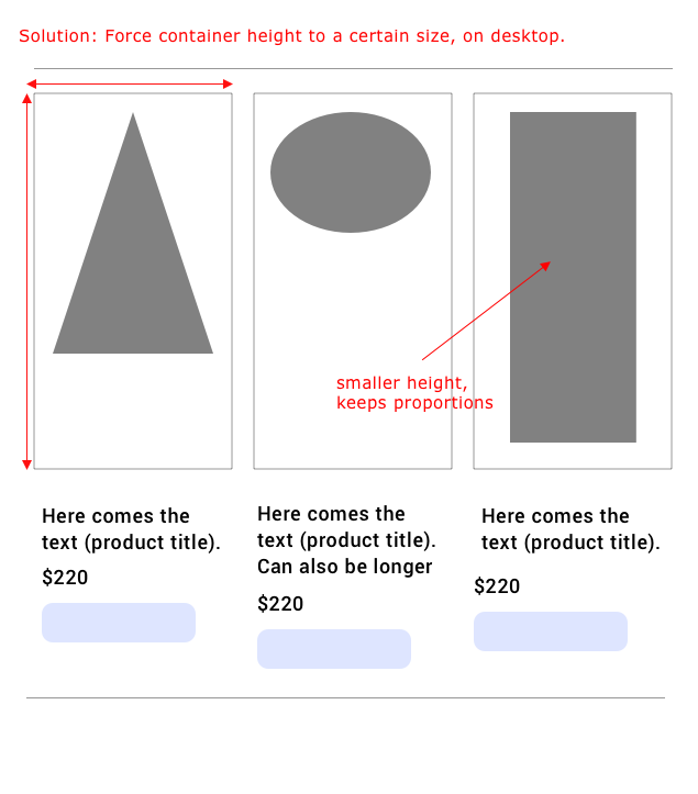
So to generalize this solution we present it below. The container of the images are framed with light gray and the images are the dark-gray elements.

The solution below is to determine a height that could accommodate all your images in order to line-up the product titles and buttons.

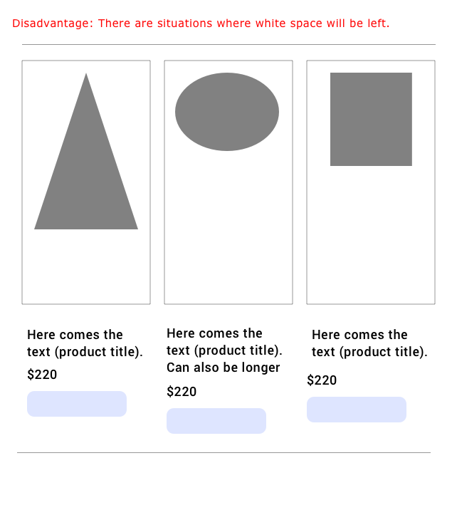
The disadvantage of this is that there are cases where all images in a raw are small and there will be whitespace left.
